Stronger
Foundations
Through
The Process Behind the Project
Each project offers a unique set of learning challenges that explore the foundations of design in order to create thoughtful and engaging work. From typography & copy layout, to brand systems & campaign rollouts – every solution builds on skill, intention, and creative perspective.
These projects showcase a variety of skill and exploration to create something personal that tells a story. It's an exciting journey of growth and development being shaped by curiosity and driven by determination.

Connection through Agriculture and Community:
Festival Campaign & Promotions
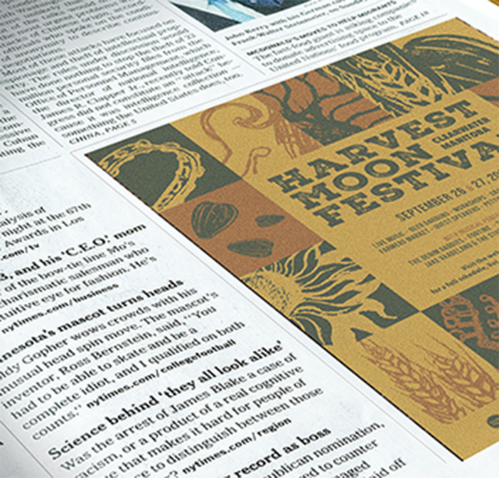
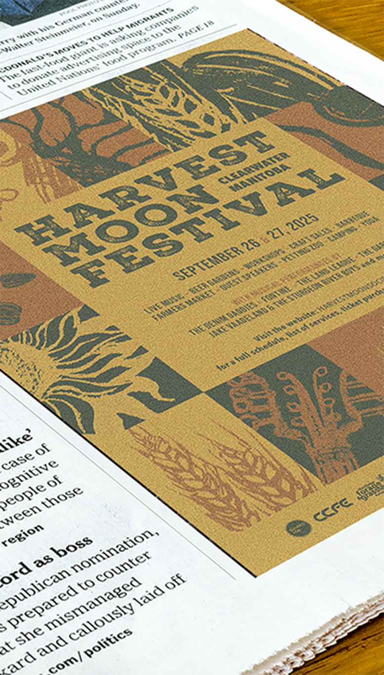
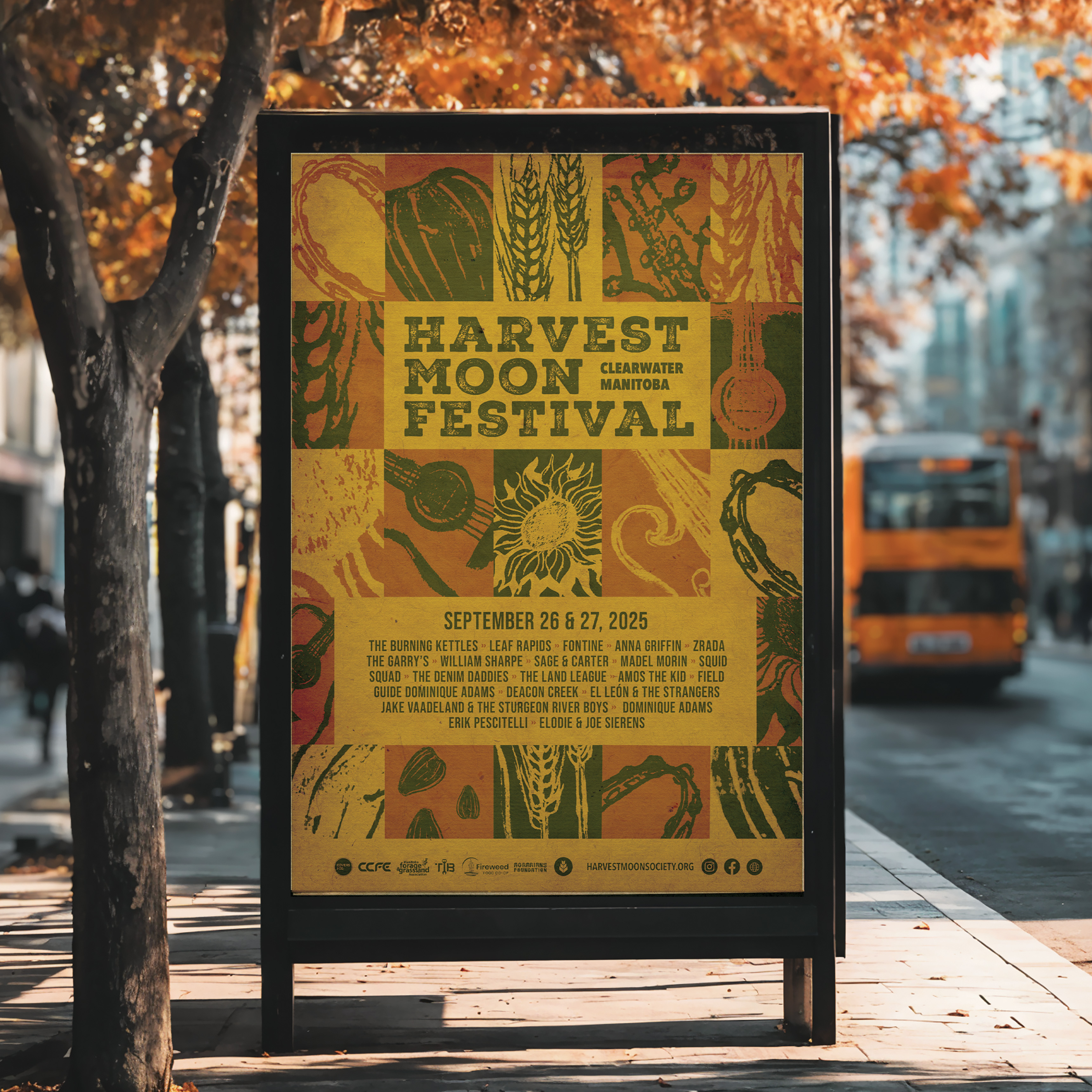
The design for this Harvest Moon Festival prioritizes connection and agriculture education through music and community. Using color theory and hand-illustrated assets to reflect the brand's natural tone, the poster features a bold checker of flat assets to evoke the symmetry of a fall blanket. A warm and cool fall color palette—ranging from crisp navy greens to symbolize the nights and a juxtaposing heat of sunlight and energy.
The process began with exploring the event's details, previous art direction, and reviewing historical band line-ups. The festival is rooted in the community of Clearwater, Manitoba, with an inclusive folk vibe and a diverse audience. The final poster captures the essence of the event while promoting its values and status around sustainable living.
The design for the Harvest Moon Festival promotes community connection and education around agriculture, using a warm and cool color palette and hand-illustrated assets. The final poster blends fall patterns and harvest imagery to create a welcoming, folk-inspired visual identity that supports sustainable living.
Branding and Promotional Content
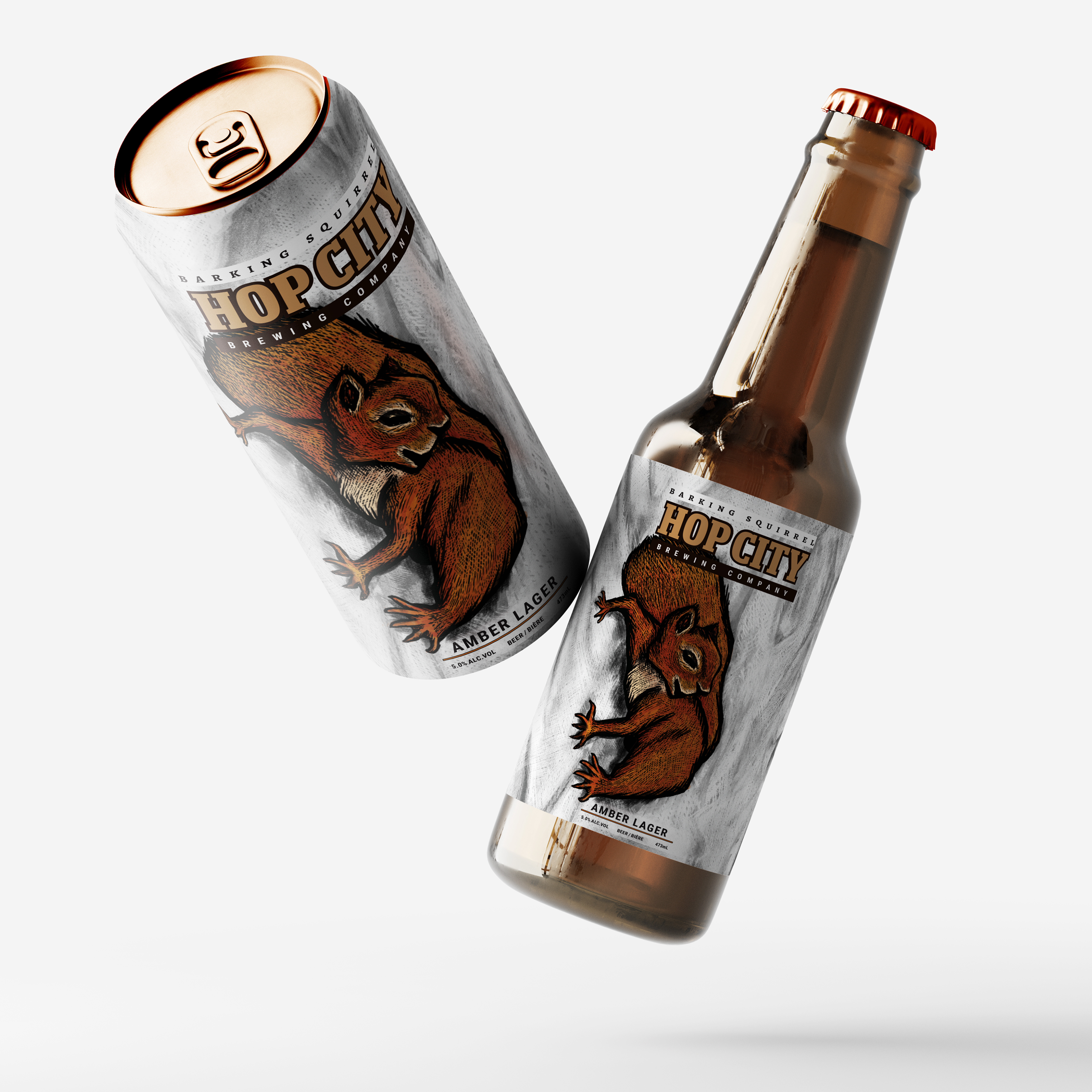
The redesign for Barking Squirrel focuses on amplifying the brand's personality and positioning it
as a "natural" choice for supporting Canadian breweries. While maintaining its quirky and wild
appeal, the new design features a bold, textured illustration against a smooth matte bark texture
finish. Topped with an irridescent amber cap and base as rich as the ale inside to catch the
buyers attention.
The process began by exploring the brand's identity, values, and target audience, followed by
compiling a visual and written moodboard.
I sketched initial concepts by hand, then refined them digitally in Illustrator and procreate. I
translated the technical drawings into vector illustrations, ensuring the logo would work seamlessly
across different sizes and mediums. Through careful considerations, I emphasized playful elements
and bold
typography to give the brand a more dynamic and approachable feel.
The Barking Squirrel redesign amplifies the brand's personality, presenting it as a “natural” choice for Canadian breweries. The design blends quirky appeal with a bold, textured illustration, incorporating a refined visual identity and art direction to create a dynamic, approachable feel.
A versatile new campaign and toolkit for Child Care Now
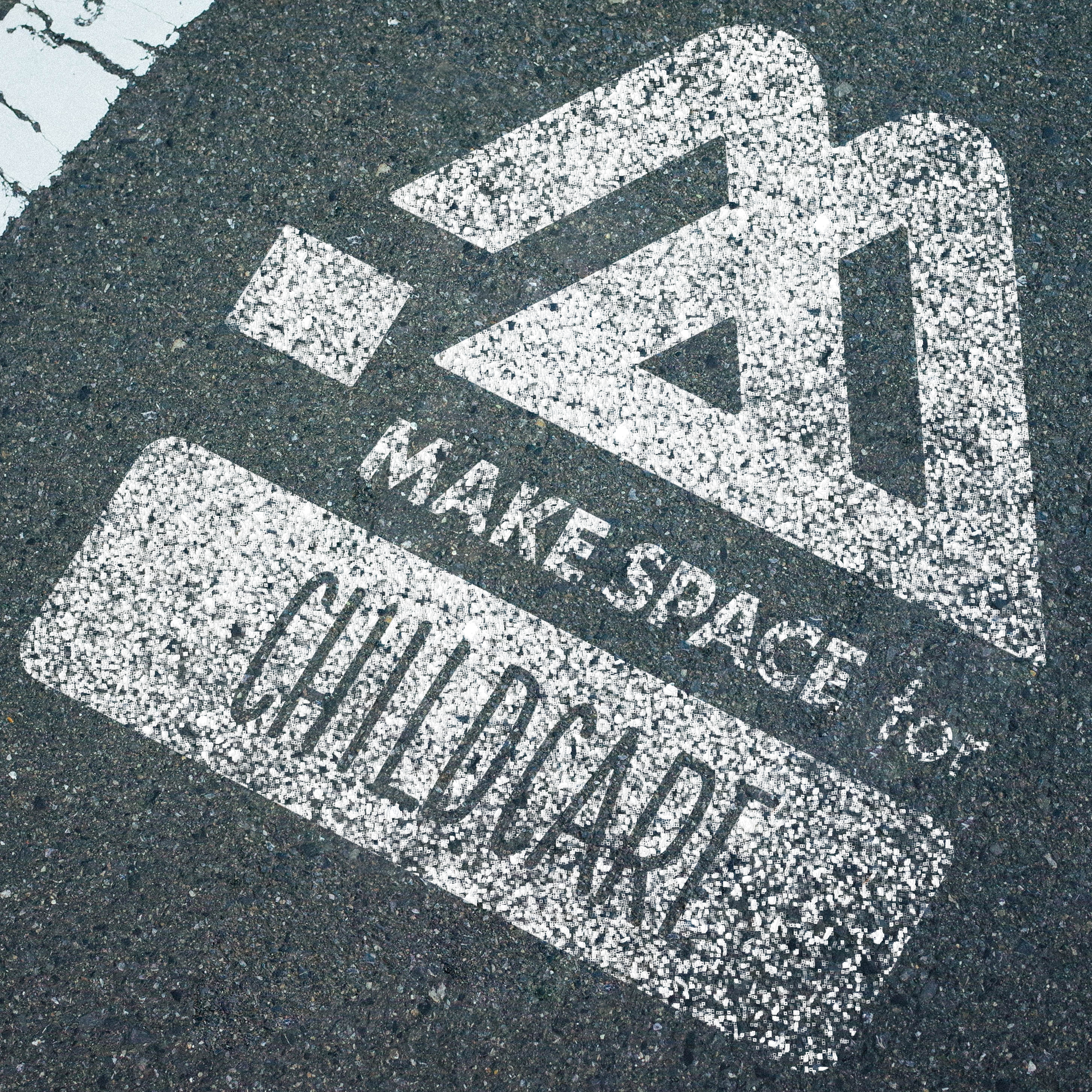
The "Make Space for Childcare" campaign by Child Care Now prioritizes repurposing underutilized,
neglected, and overpriced heritage spaces to address critical community needs. The campaign employs
a literal, constructive approach to promote the development of affordable childcare facilities. With
the goal of driving actionable involvement, the campaign empowers communities to advocate for change
and physically start marking spaces for reconsideration such as empty lots and heritage
architechture.
The brand toolkit created for the initiative provides a cohesive
visual identity, designed to communicate the importance of these transformations. Deliverables
include visual expressions for print and social media by first developing a comprehensive brand
toolkit, logo design, and a pitch for an ambient/guerrilla campaign to amplify awareness and
engagement.
The "Make Space for Childcare" campaign repurposes neglected spaces and heritage buildings at risk of foreclosure, focusing on actionable community involvement. Deliverables include visual tools, logo design, and a guerrilla marketing pitch to promote affordable childcare.
Brand Identity, Toolkit, & Expressions
For DELS Electric Motor Supply, a local business established in 1927, the goal was to gently
modernize the brand while honoring its long-standing legacy. The new identity incorporates a 1970s
automotive industrial aesthetic, using Canadian electrical code colors—red, blue, and white—to evoke
reliability and professionalism.
A bold, widescreen geometric font, which provides structure
for
both horizontal and vertical orientations and adds versatility to the brand's visual language. The
brand toolkit includes expressions for merchandise such as clothing, stationery, and everyday items
one might find around a service shop, ensuring consistency across all platforms and products while
giving the brand a refreshed, cohesive presence.
The new brand identity for DELS Electric Motor Supply modernizes the visual language of this 1927 company, utilizing 1970s automotive industrial aesthetics and Canadian electrical code colors. The toolkit features geometric fonts and merchandise expressions to provide consistency and a fresh look.

For this editorial illustration of The Walrus, the primary focus was on raising awareness about the
Missing and Murdered Indigenous Women (MMIW) crisis in Winnipeg, specifically honoring Morgan Harris
and Marcedes Myran, whose remains were recently identified in the Prairie Green Landfill in
Winnipeg.
The design features a storm of navy blue and forest greens, with a bold
transparent red figure emerging from textured hills representing the site. The female figure,
displaying a strong sense of poise and defiance with a middle finger directed at the Conservative
slander campaign that attempted to halt the search, embodies both the pain and the strength of
Indigenous communities fighting for justice. Through symbolism and striking imagery, the artwork
conveys a powerful statement about resilience and the need for continued advocacy.
This editorial cover for The Walrus raises awareness about the Missing and Murdered Indigenous Women crisis, with a powerful red female figure emerging from a landfill. Striking imagery and symbolism convey defiance, strength, and the ongoing fight for justice.
Concept, Process, and Execution
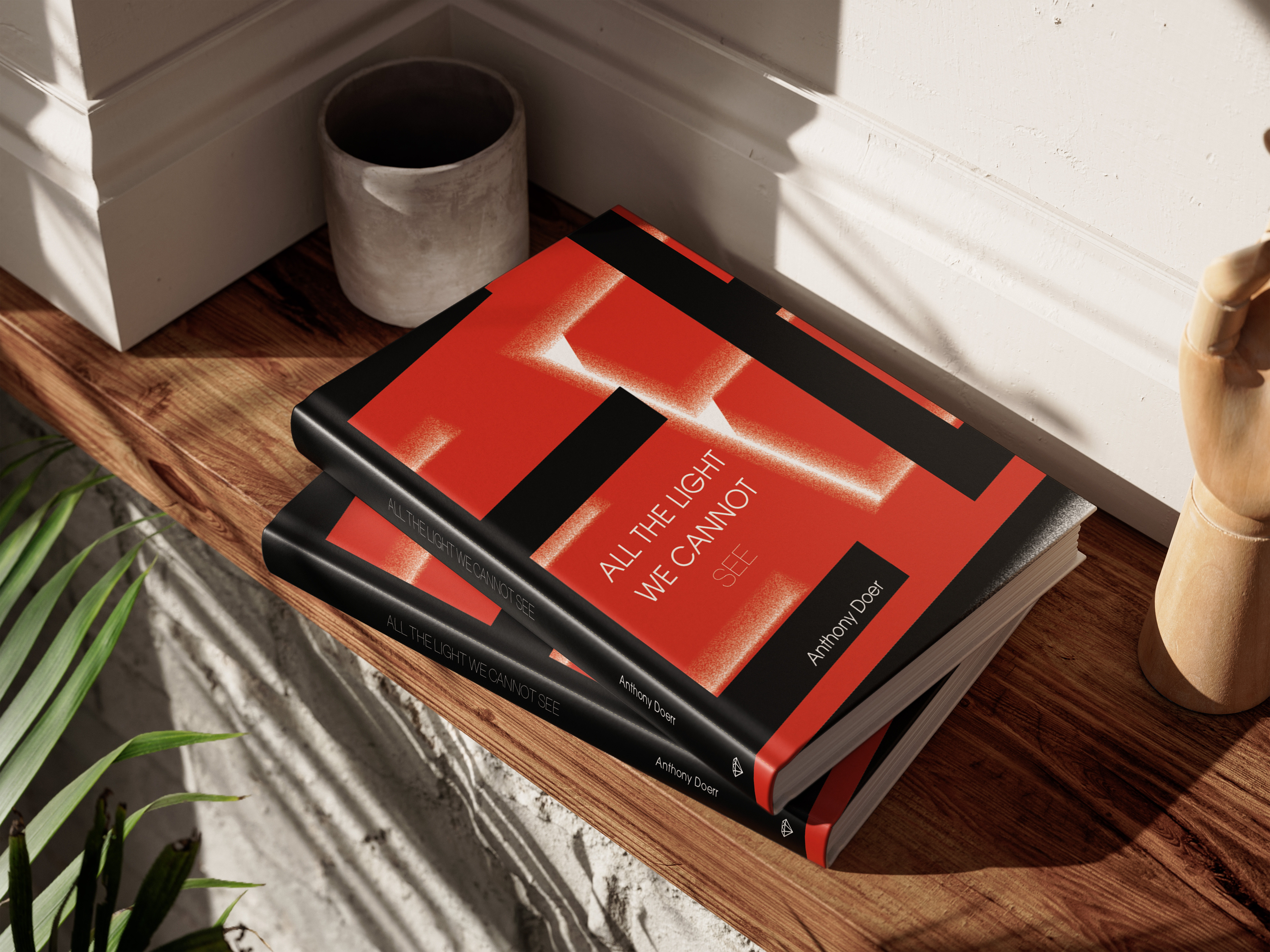
All The Light We Cannot See by Anthony Doerr. The book jacket design explores the duality of the
story's setting during the invasion of France. The design features hidden elements, including 3D
city models, and uses Reich red to symbolize the oppressive regime's presence. Static textures
and iconography are incorporated to link directly to the plot, while sharp contrasting imagery and
bold colors emphasize themes of fear and rigidity.
The two-color design serves to visually
represent the conflict between the story's two protagonists and the larger war unfolding around
them. The eye-catching combination of textures and bold contrasts makes the jacket stand out amidst
the vast sea of books on display, grabbing attention from potential readers. The minimalist approach
not only
reinforces the emotional weight of the story but also ensures the cover captures the viewer's
interest at a glance in any setting.
The book jacket design features hidden elements intentional swatches that symbolize fear and oppression. Contrasting textures and bold imagery capture the tension between the story's protagonists and the larger war context.
Concept, Process, and Execution
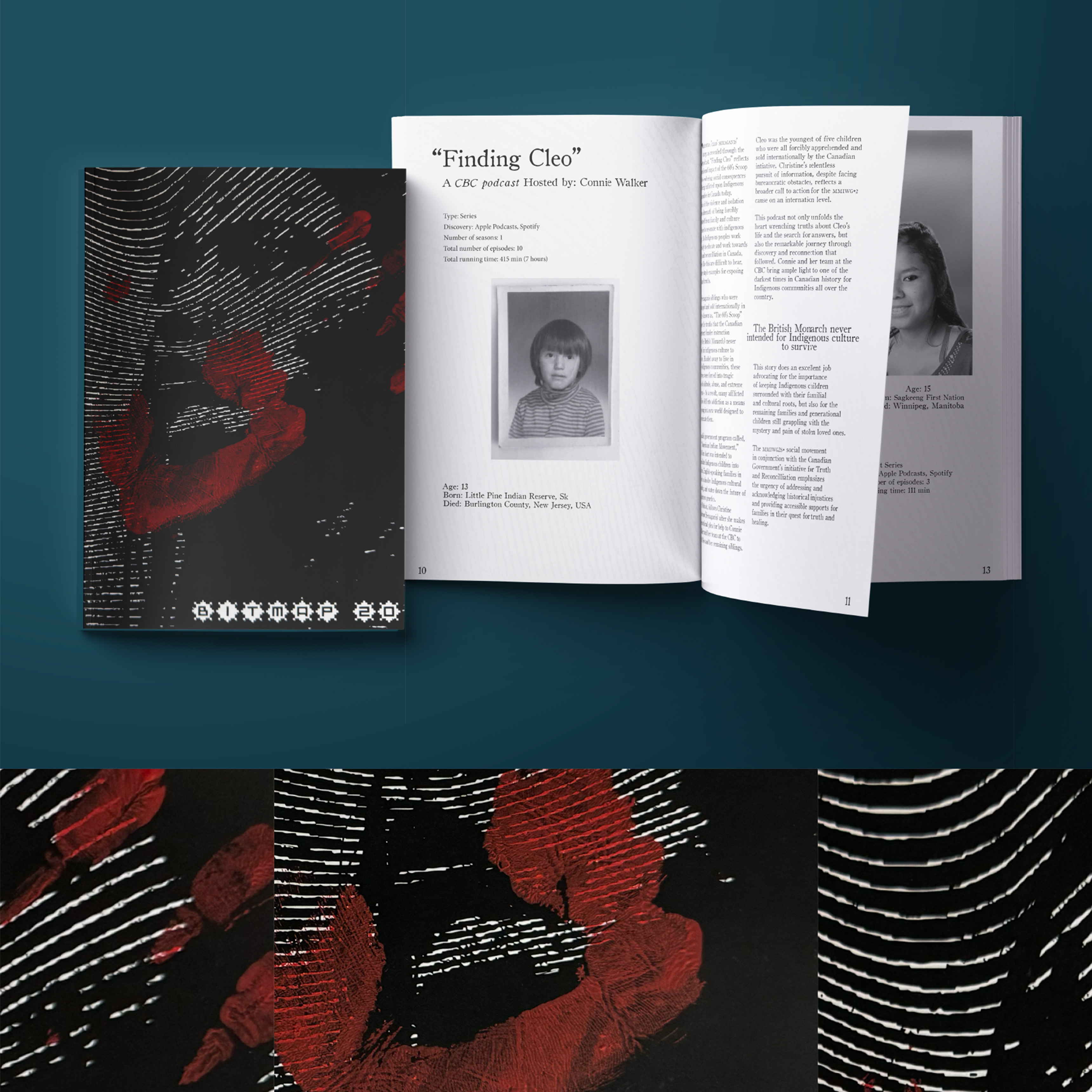
The MMIWG2S+ Canadian True Crime Zine focuses exclusively on Canadian cases of missing and murdered
Indigenous women, girls, and two-spirit individuals, with an emphasis on education, transparency,
and reconciliation. The cover design uses a black-and-white image of an Indigenous woman, with a
hand-applied red handprint, symbolizing the ongoing crisis. A fingerprint texture in the background
reinforces themes of identity and the need for justice.
The typography layout and hierarchy
are key to this design—carefully crafted titles, subtitles, and episode information are presented in
a structured yet impactful way. Bold typography ensures the zine's message stands front and center,
with subtle variations in size and weight to guide the reader through the content while maintaining
a respectful tone. The minimalist color palette, combined with intentional type design, allows the
project to balance visual impact with sensitive storytelling.
The MMIWG2S+ Zine highlights Canadian cases of missing and murdered Indigenous women, featuring a minimalist black-and-white design with a red handprint to symbolize the ongoing crisis. Thoughtful typography and layout structure the content while maintaining sensitivity and visual impact.
Concept, Process, and Execution
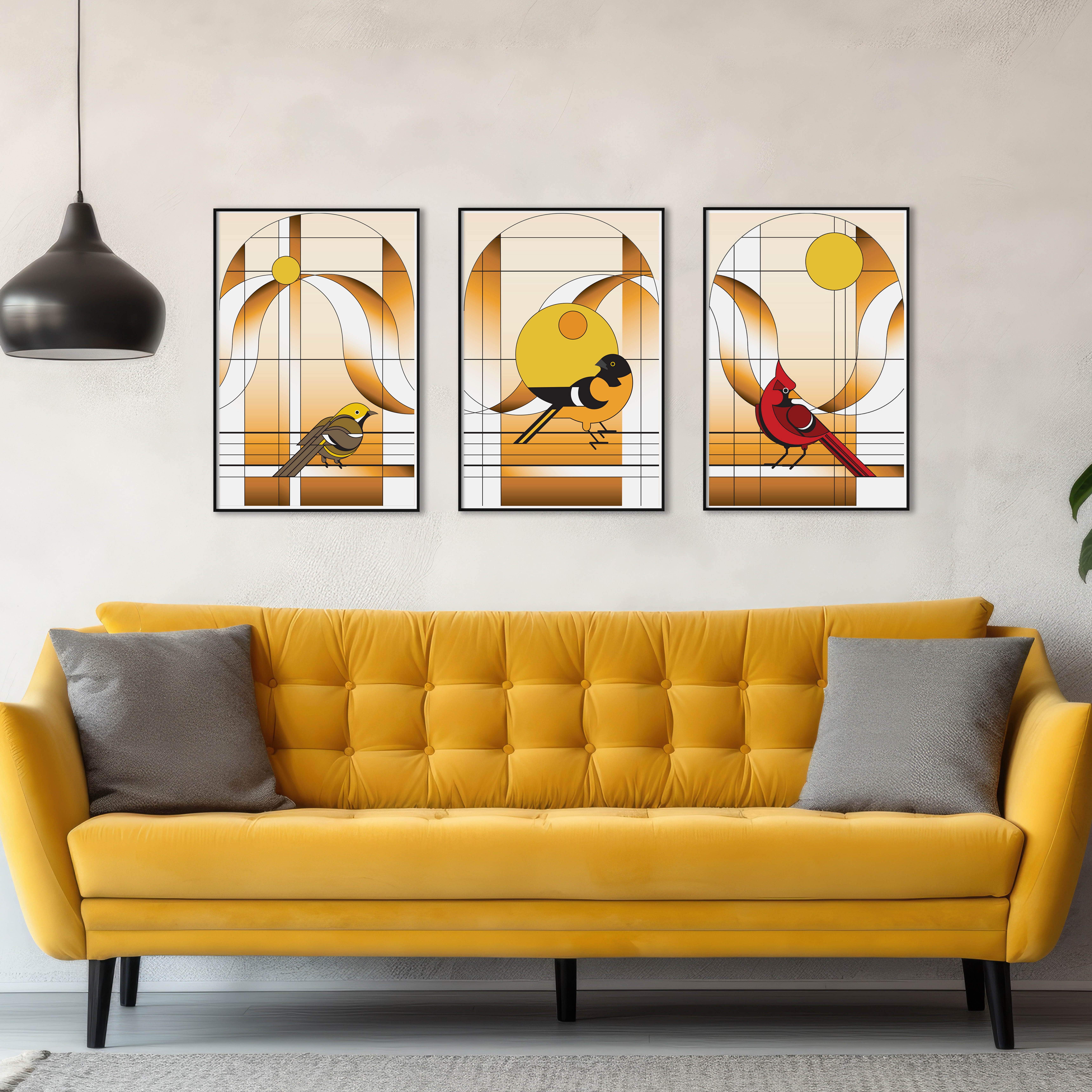
This illustrated print set evokes the nostalgic feel of a vintage kitchen, inspired by
Pyrex
dishware, wood paneling, and iconic 70s wallpaper murals. The set features three geometric
birds in
a stained-glass style, including a cardinal, Baltimore oriole, and a Chestnut warbler, each
representing my love for stained glass, Art Deco, and birding.
The warm 70s color palette of
yellow,
orange, and brown enhances the nostalgic theme, while flat geometric shapes and clean lines
are
influenced by the Bauhaus style. The prints celebrate a bygone era with playful yet
sophisticated
design, merging personal passions with retro aesthetic elements.
This illustrated print set evokes nostalgia for the 70s, inspired by Pyrex dishware and mid-century interiors. Geometric birds, including a cardinal, Baltimore oriole, and chestnut warbler, are rendered in a stained-glass style, blending personal interests with retro design influences.
Concept, Process, and Execution
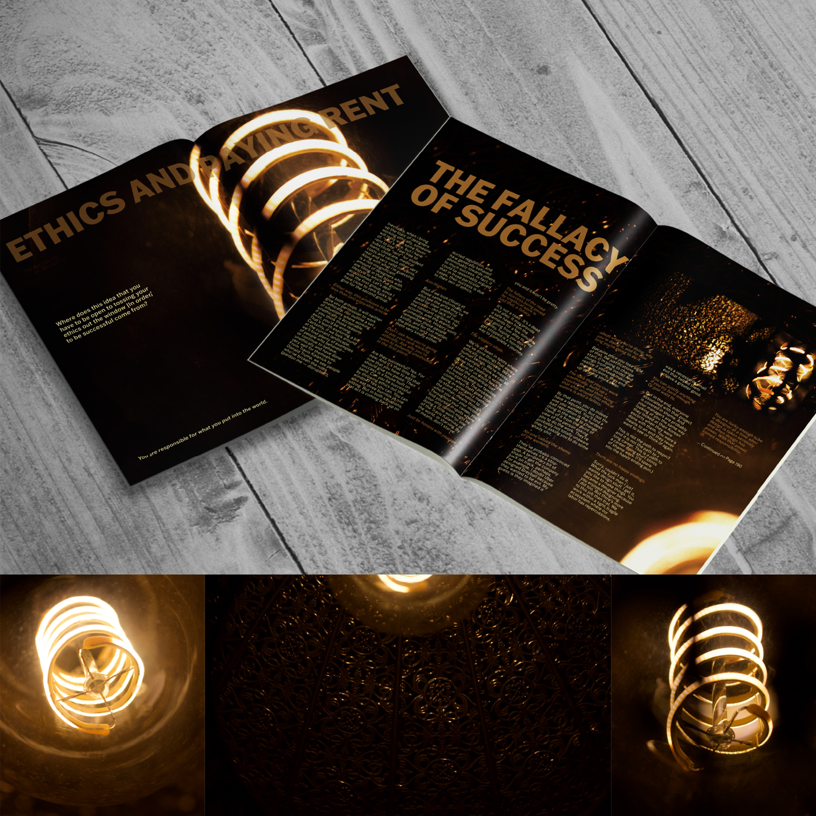
This editorial double-spread layout visually supports the article Ethics and Paying Rent,
which
discusses the ethics of employment decisions beyond financial gain. The spread features
high-resolution, close-up photography of a gilded Edison lamp, capturing the glow of the
electricity
as it radiates a luring light against intricate gold filigree.
This striking visual
symbolizes the
metaphor "like moths drawn to a flame," representing the allure of financial temptation.
Layout
considerations were made for large body copy, ensuring readability while maintaining visual
interest. The juxtaposition of imagery and text guides the reader through the article, with
typography and layout working together to create a dynamic yet thoughtful reading
experience.
The editorial spread uses high-resolution photography of a gilded Edison bulb to symbolize the metaphor “like moths drawn to a flame.” The layout balances striking visuals with readable body copy, creating an impactful reading experience that ties ethics with temptation.
Concept, Process, and Execution
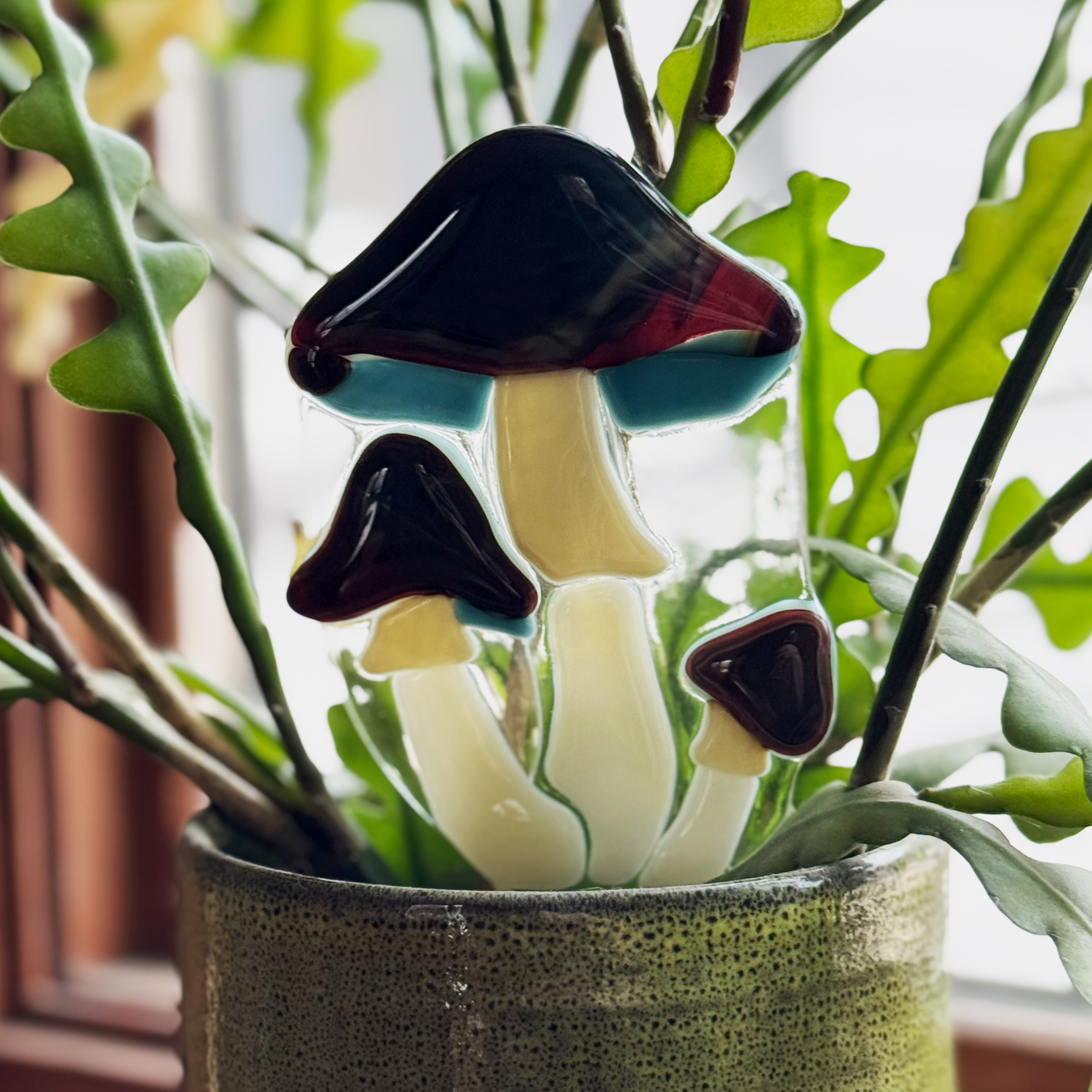
The Fused Glass Plant Pokes are crafted using stained glass techniques to create sturdy, washable
layered glass accents for houseplants and pots. Featuring mushroom designs in soft blues, cream, and
amber, the pieces add a whimsical touch to any plant display.
The process involved cutting, grinding, and firing glass to precise melting points—balancing
creativity with technical skill to preserve the intricate details. The final product is complemented
by elegant matte black packaging with a viewing window, giving it a luxurious, high-quality finish.
Through this project, I gained hands-on experience in business management, including quoting,
invoicing, package design, and
freelancing.
The fused glass plant pokes are whimsical yet sturdy houseplant accents crafted from layered glass. The design features mushroom motifs in blues, creams, and ambers, with packaging that adds a touch of luxury through matte black and a viewing window to highlight the product's craftsmanship.